SIMPLE HABIT
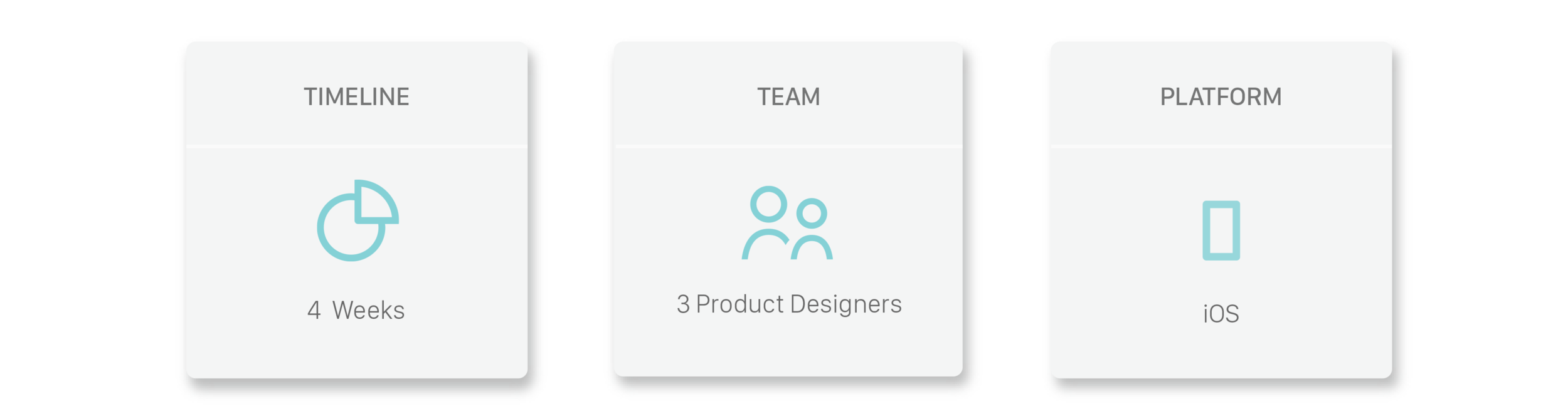
Opportunity: Research, User Testing, UX/UI Design (iOS)
Challenge: Uncover Pain Points, Improve Onboarding
Role: Lead Product Design Consultant (Contract)

Simple Habit is a meditation app that is targeted towards busy professionals.
Opportunity
We worked with the Simple Habit team to discover current pain points and maximize the value eduction.
Role
I worked as the lead product design consultant with a team of designers on the below:
- Led research and user testing with target users, synthesized all information through affinity mapping/personas
- Led the design studio, designed Lo-Fi mockups, and validated with target users
- Led the team during Hi-Fi, created Hi-Fi prototype, iterated and validated through user testing
Process
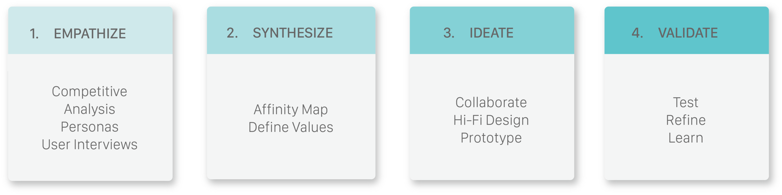
1. Empathize
Understanding the Current Problem
This project started as a case study. I chose the app, Simple Habit, because of my passion for meditation and its promising content. However, during guerrilla testing all users were so frustrated during the onboarding and initial interactions that they would barely make it to exploring the content.
Therefore, I learned that my main focus should be on resolving the initial pain points that users face such as understanding the value and navigating free content.
I then proposed my findings to the team at Simple Habit and we worked together to address the discovered pain points.
Goals for this phase:
- Comprehension of value: Understand users’ comprehension of value prior and after the use of app
- Content navigation: To understand any friction that may cause users to not explore the content
Competitive Analysis
The initial step in our research was to understand successful patterns in current products as well as missing gaps in unique values. Simple Habit offers to be the Netflix of meditation in the market so we wanted to better understand what that means for Simple Habit.
We performed our points of analysis on the below:

User Testing
During this phase we collaborated with the growth team on finding the target users that fit the desired persona and interest in meditation. We then spoke with 10 new users to uncover pain points on value education and navigation of content.
For this phase I led the team in the creation of questions and curating the interview process.
2. Synthesize
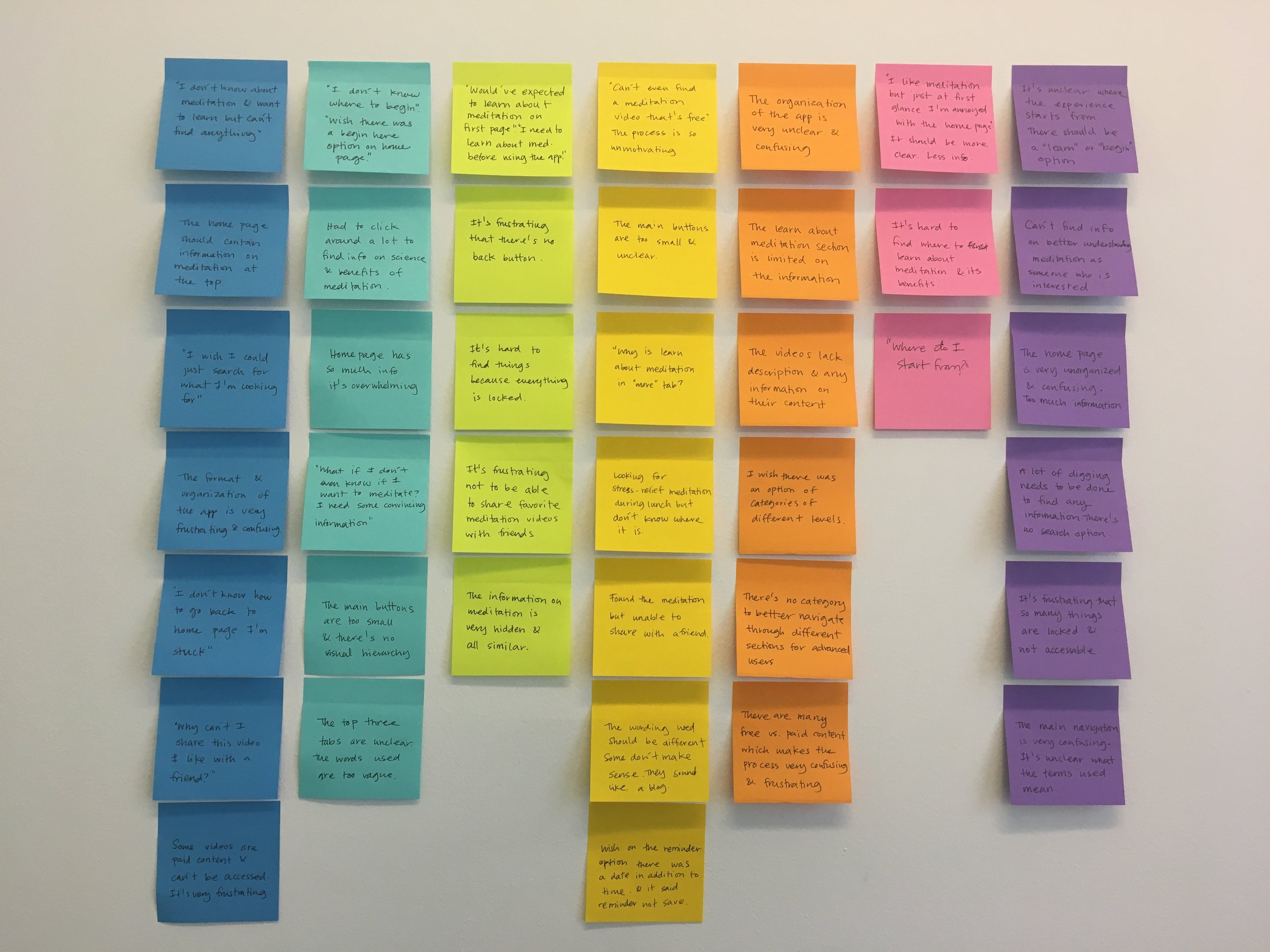
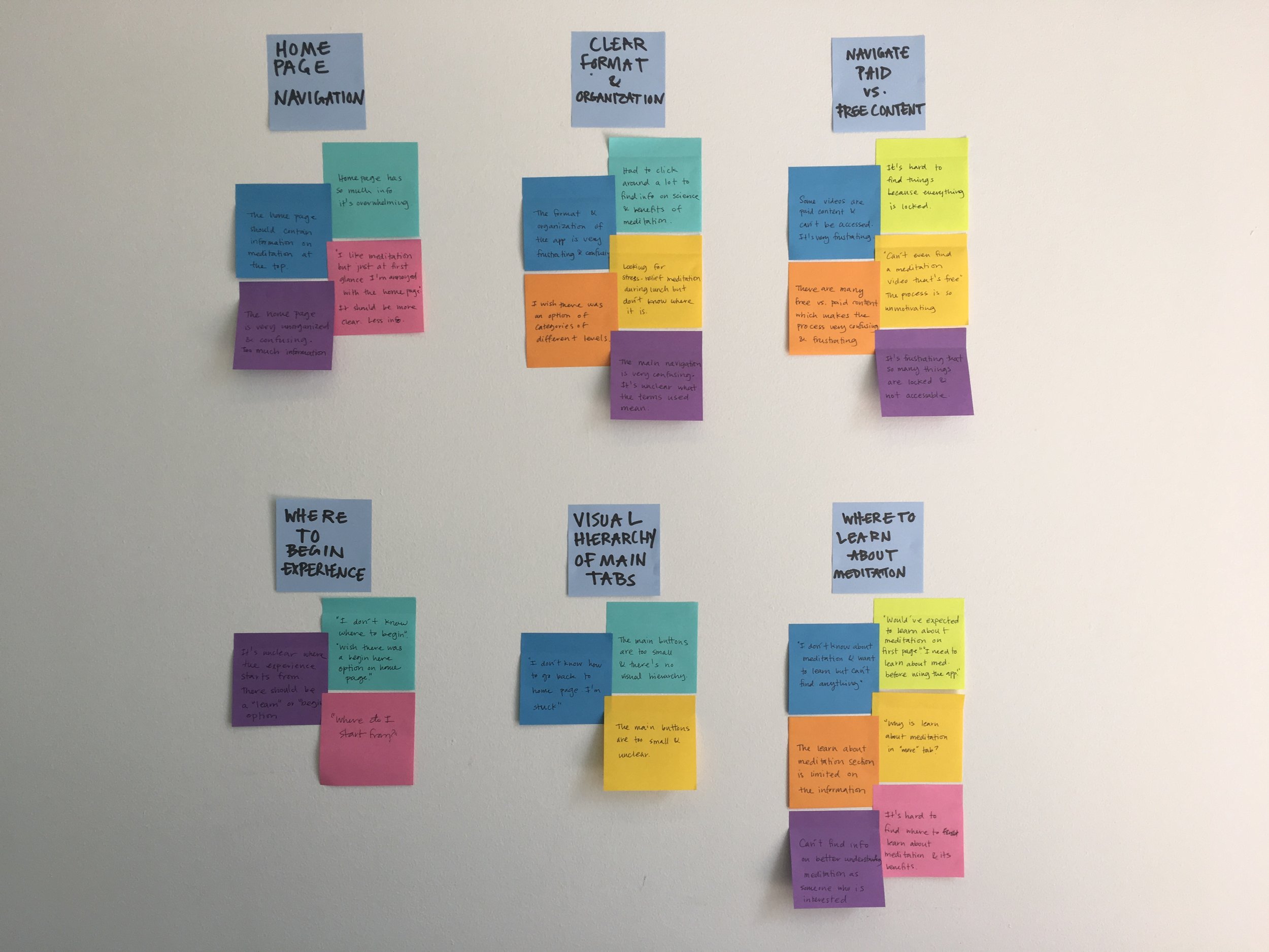
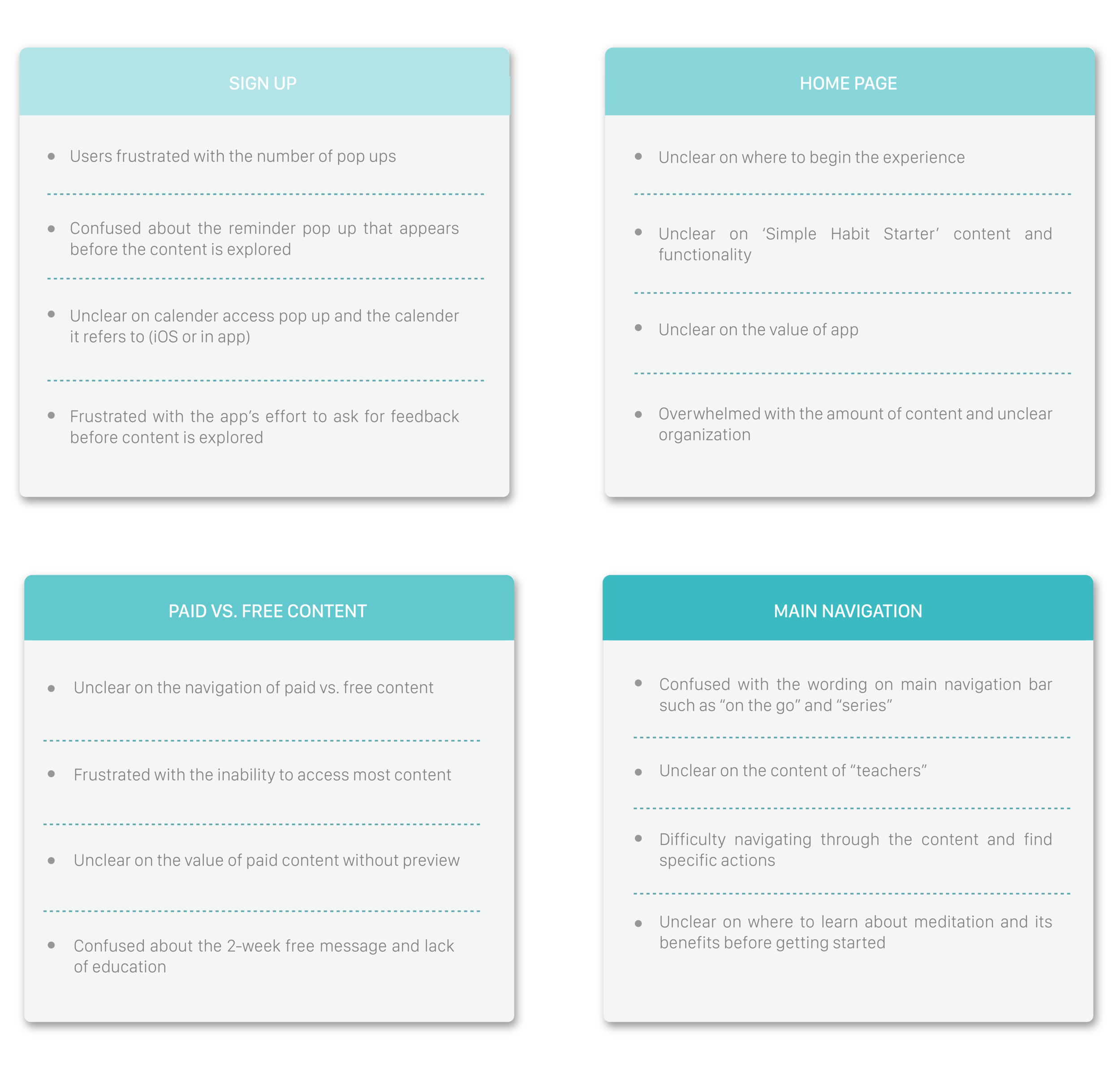
User Feedback
We Synthesized our findings under the main 4 categories below in order to create a more solid frame frame and foundation for our design moving forward:
Prioritizing Values
The findings from our research were then organized on an affinity map to better understand their relationship to each other and to determine our priorities moving forward in the process.
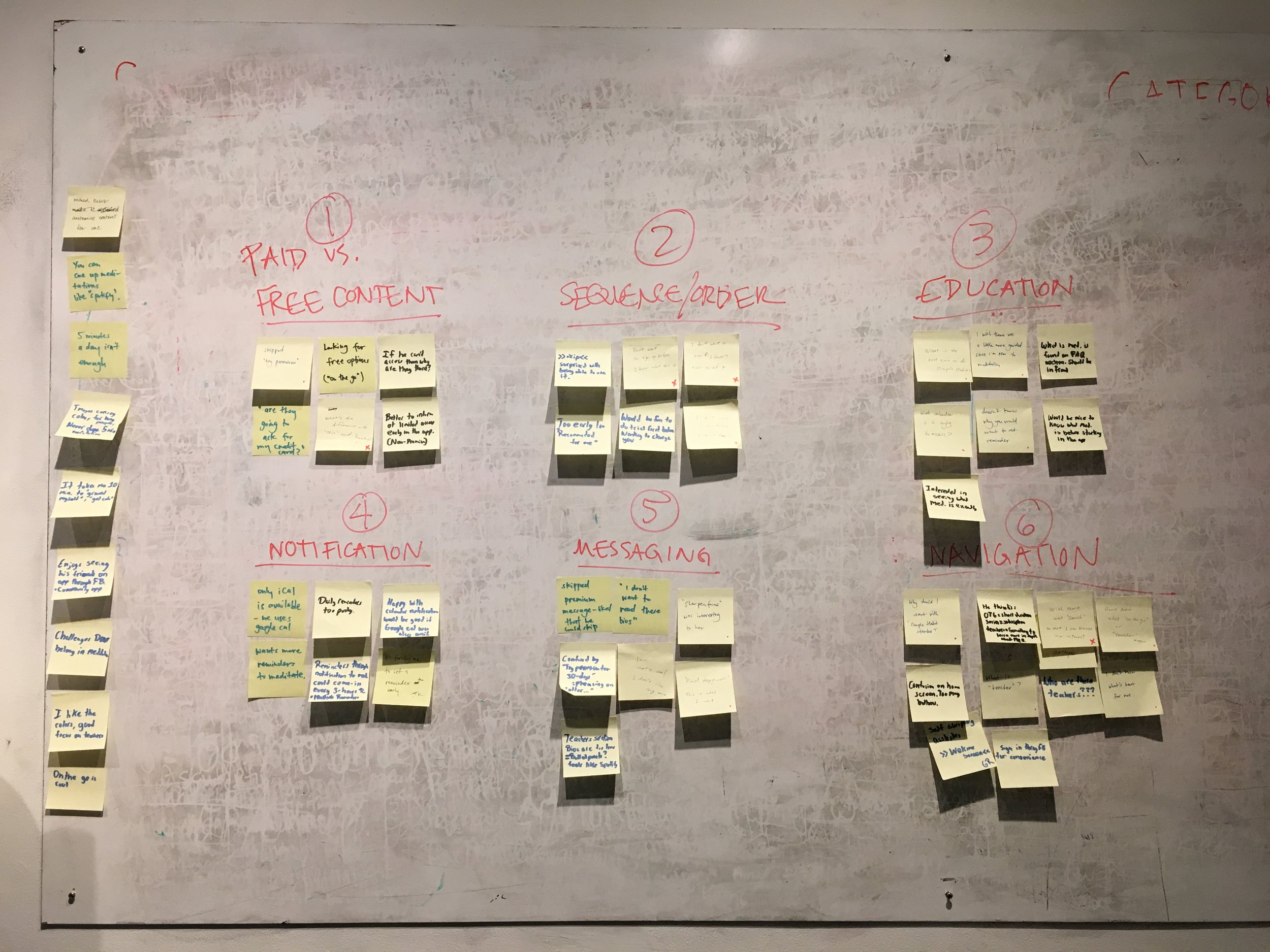
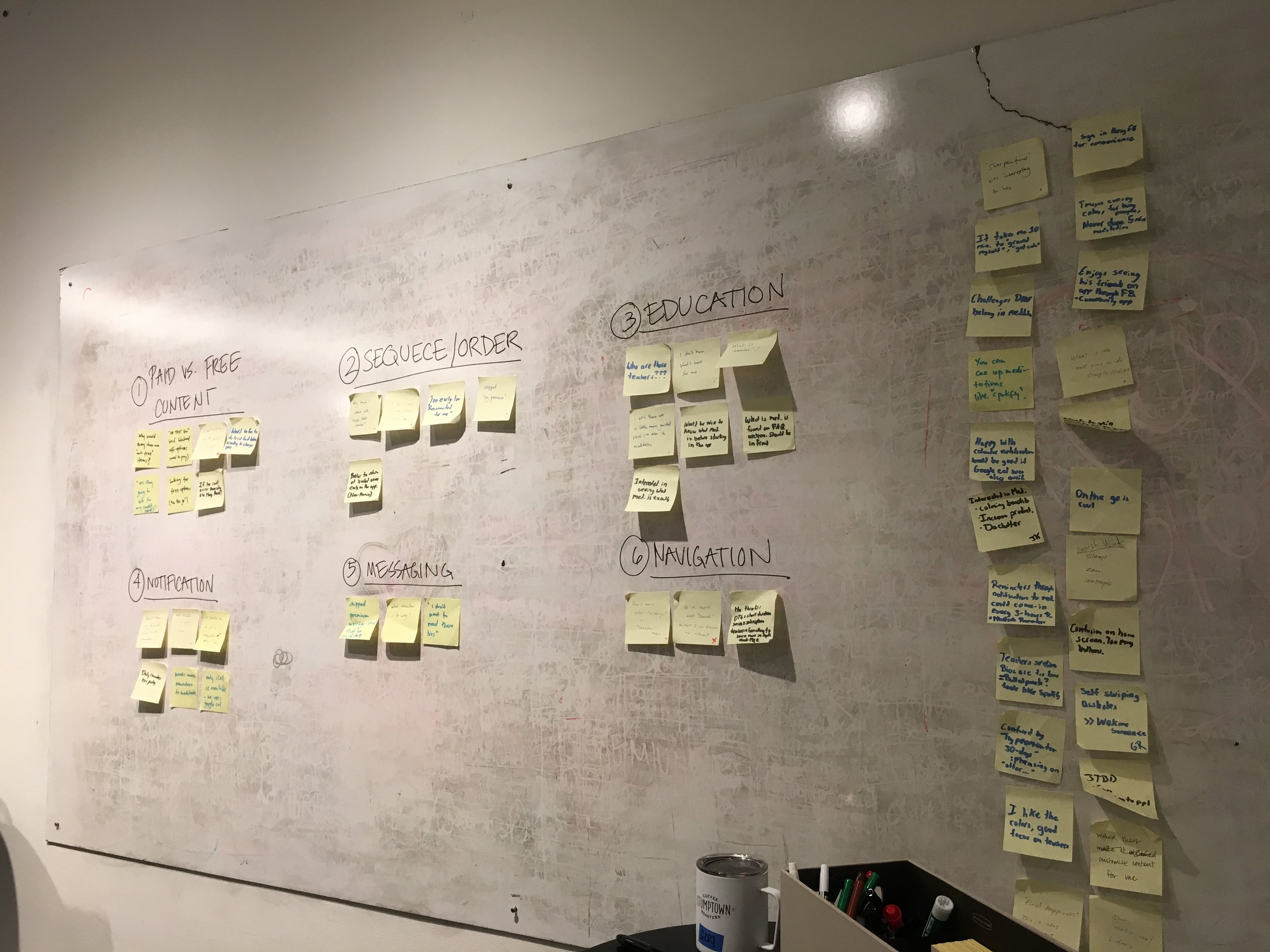
Affinity Map
Since we had a very short timeline for this project it was important for us to understand what we should focus our time on that would lead to maximum benefit to the app.

3. Ideate
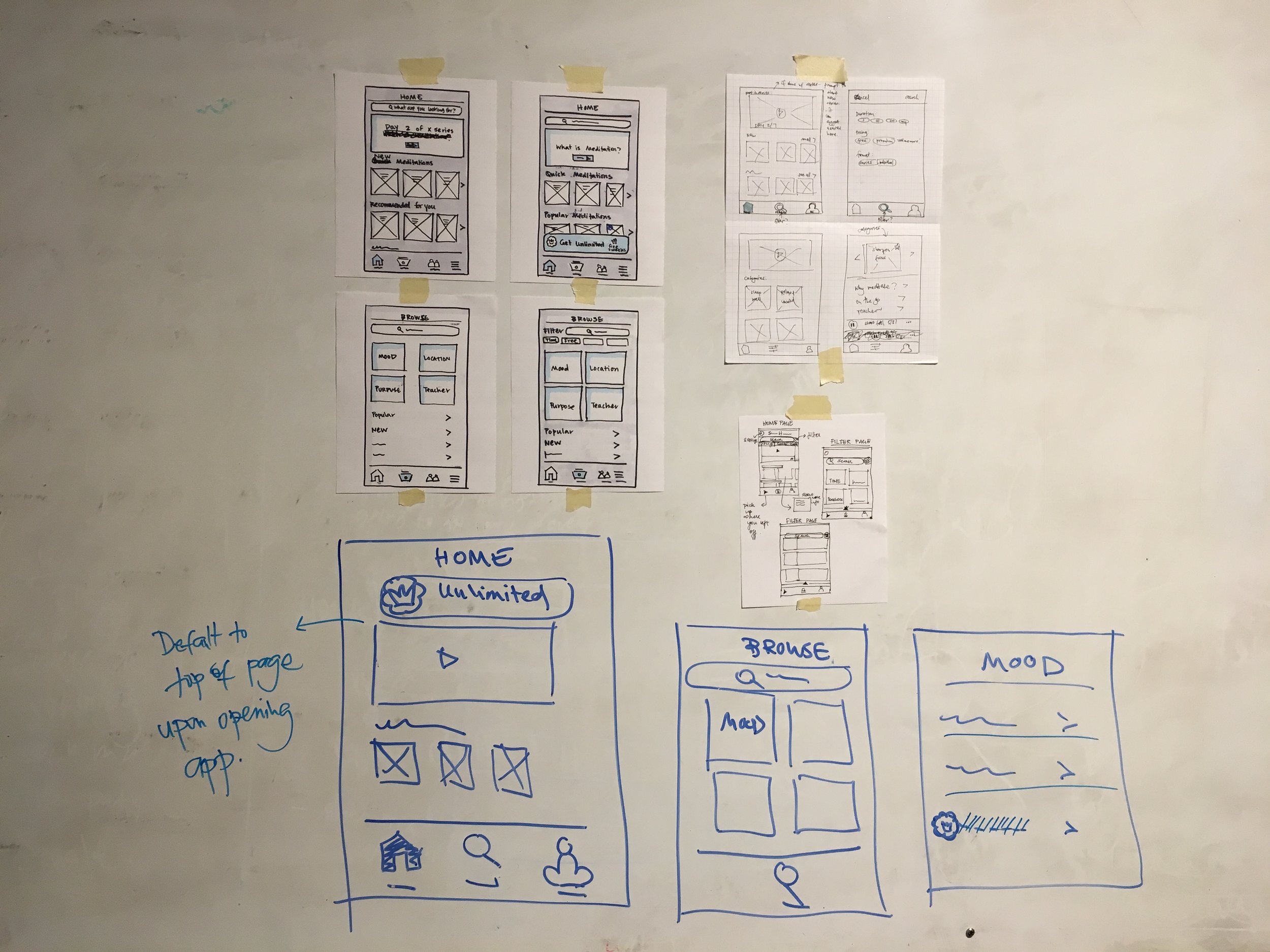
Lo-Fi Phase
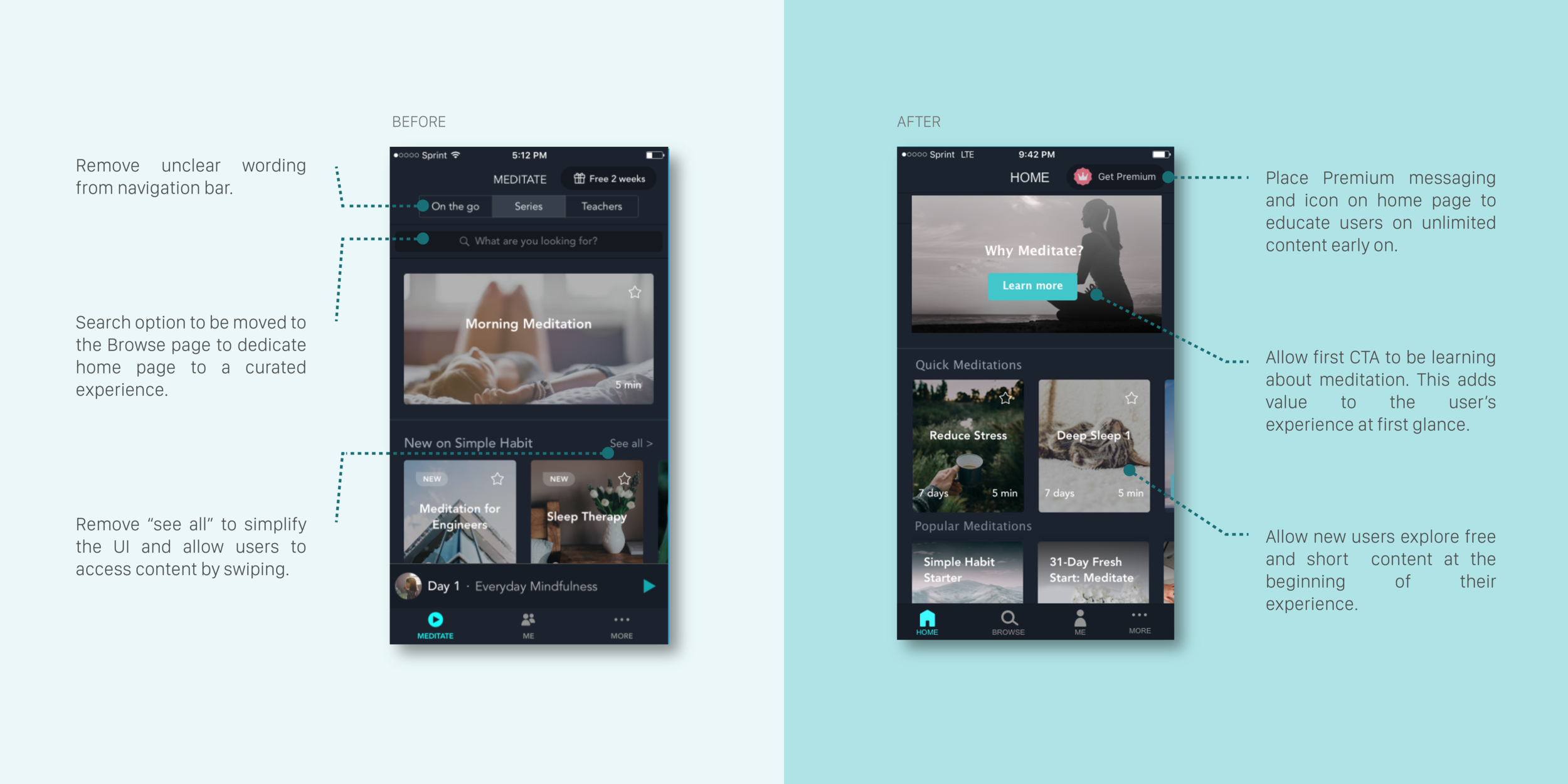
After the research phase we discovered that almost every user is unsatisfied with their initial interaction with the app. Users are overwhelmed with the amount of content and feel like there is no guidance or direction in the navigation of content.
However, once users reach the content they desire, they are very happy with the diversity and quality of the content Simple Habit offers.
Constraint: To respect the timeline we focused on making small changes that could have a great impact on the user flow.
Goals for this phase:
- Educate users on the value of meditation as their initial experience to understand value of app
- Clearly identify the difference between paid vs. free content to avoid any confusion or frustration
- Clarify the sequence of steps users need to take to navigate through content
- Provide preview content for better exploration prior to sign up for premium
- Curate the experience on home page to better communicate relevant content
Design Studio Process
During this phase the team came together to brainstorm on ideas and do rounds of critique and iteration to come up with solutions. We each came up with solutions on how to address the above goals and critiqued and reviewed our work until arriving at a set of mutual solutions.
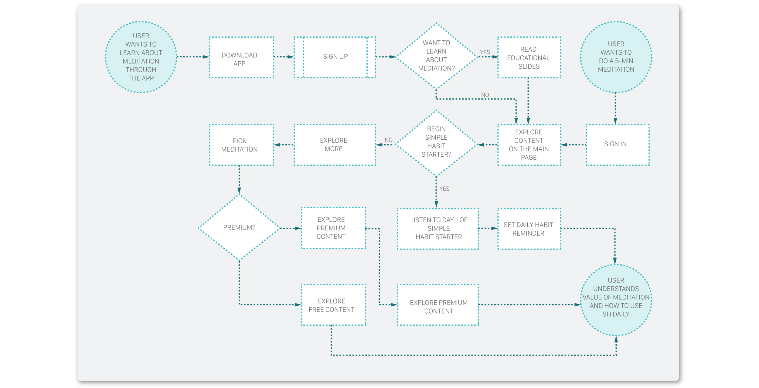
User flow: Prior to coming up with solutions we spent some time exploring the existing user flow and came up with ideas on how to improve it. Analyzing the existing flow we learned that there's a lot of friction in the order of messaging, asking users for feedback before they even had a chance to view the content.
We also learned that the app doesn't do a good job guiding users through their experience. So we focused on creating a more simple, guided experience for users.
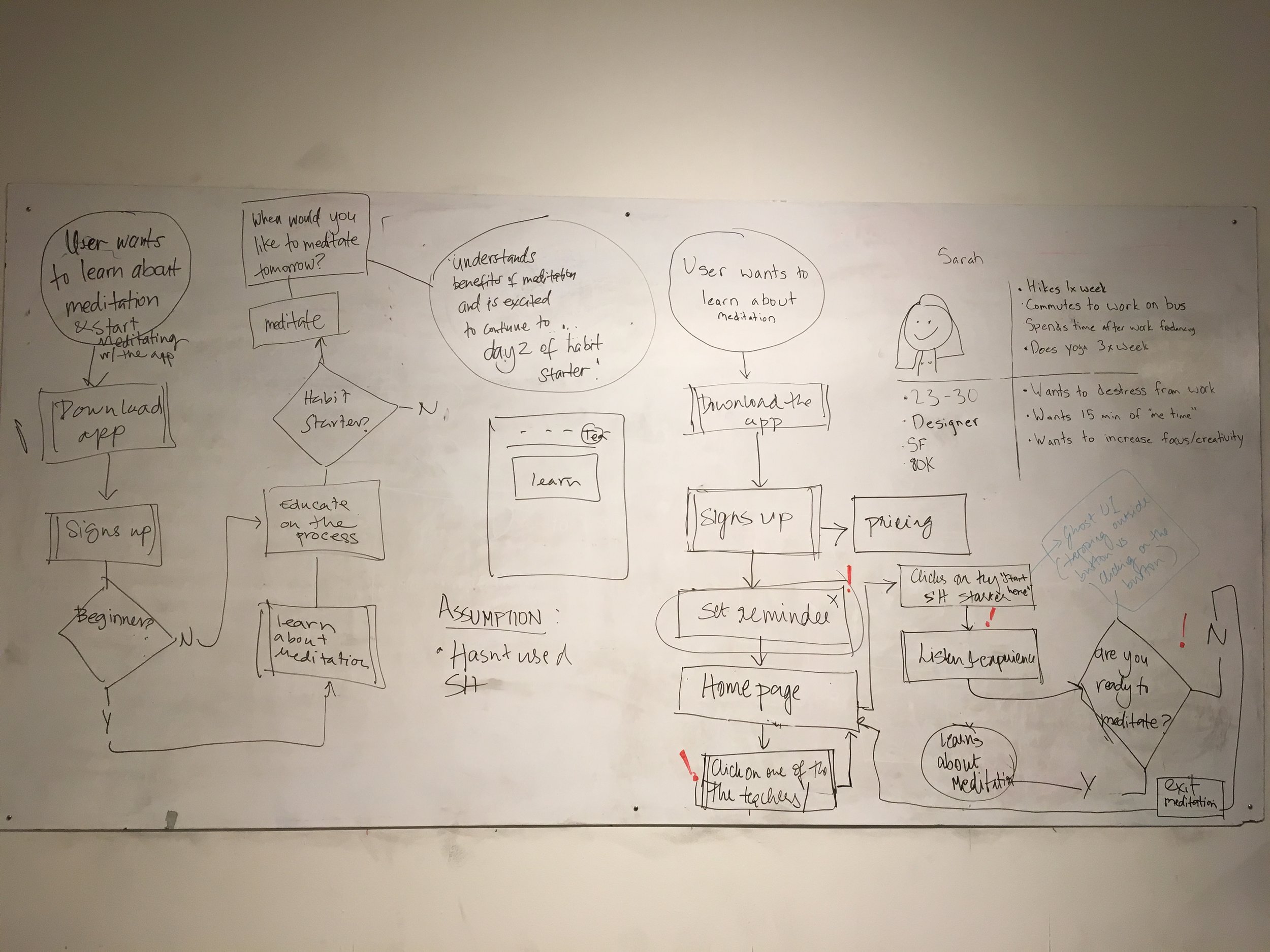
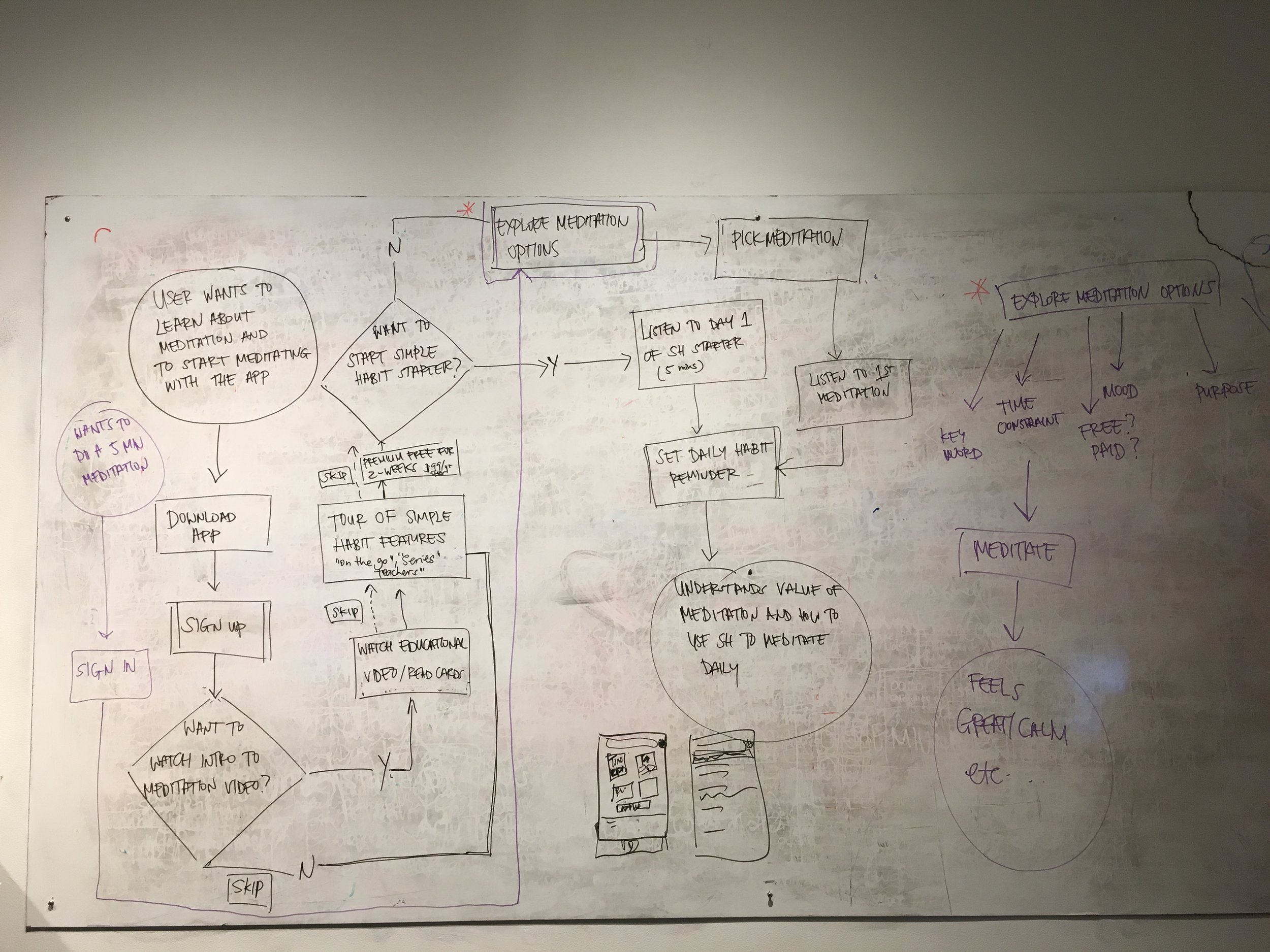
User Flow
During this phase it was important for us to redesign the flow from when the user logs into the app to when she finds her first content. Through this process we better understood the existing friction through these steps and redesigned a flow that better helped navigate the user through their initial interactions.
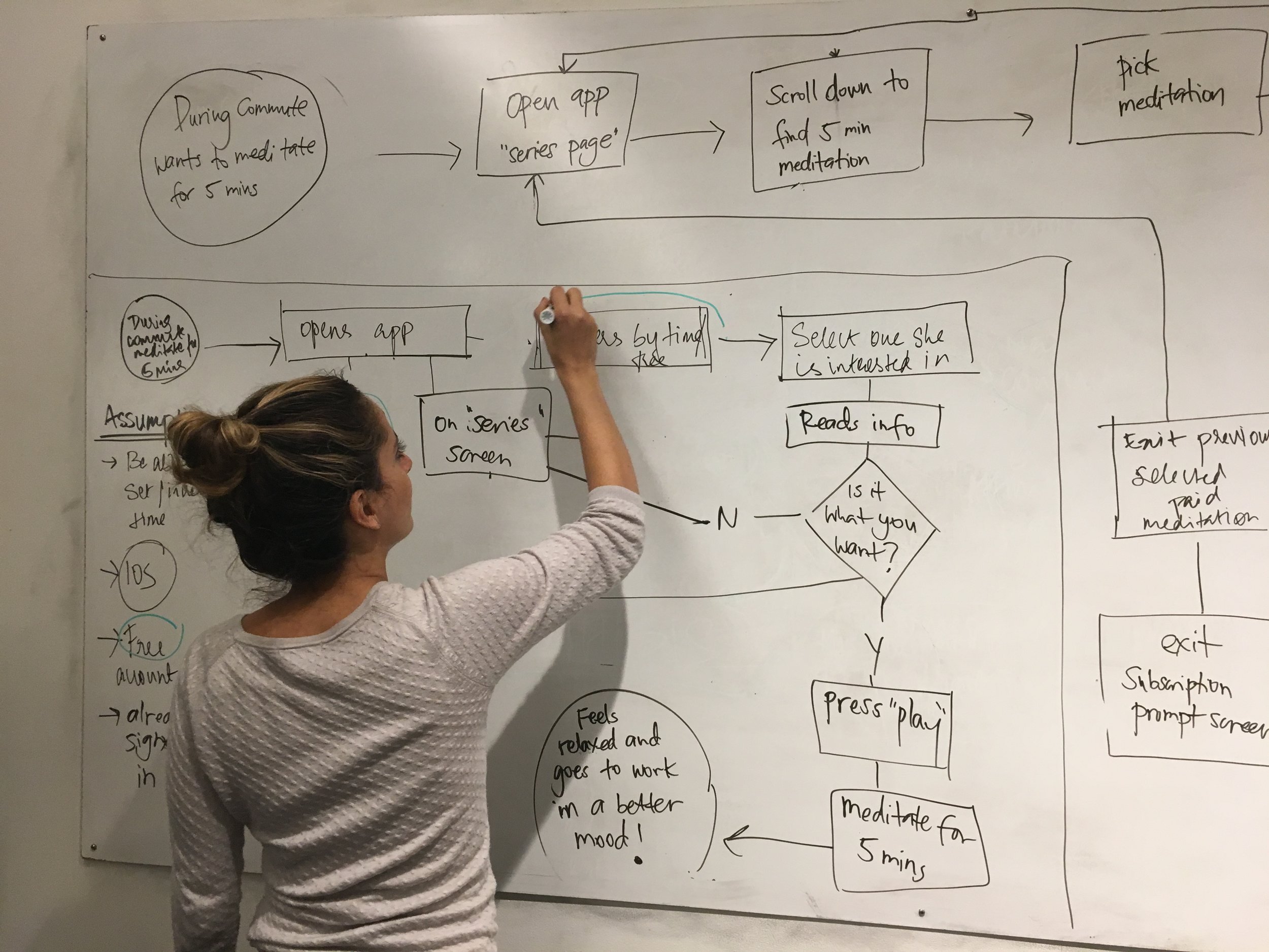
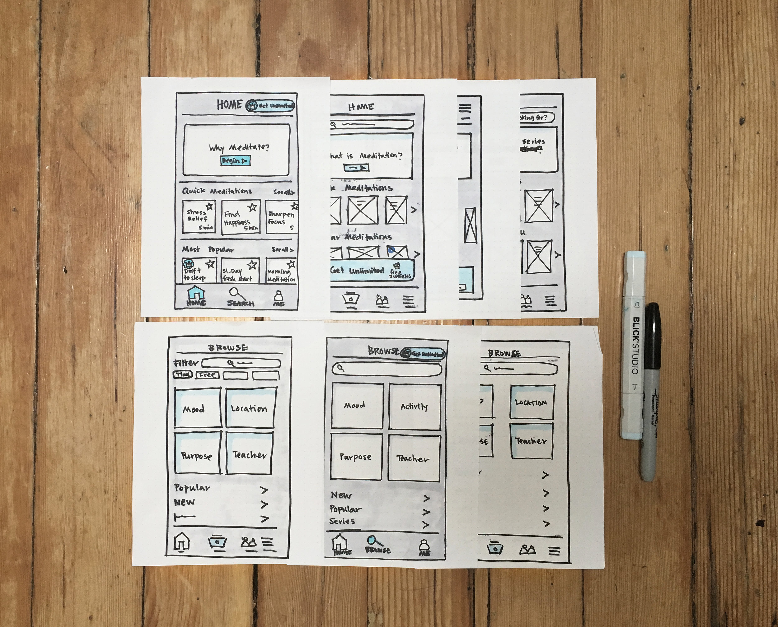
Lo-Fi Sketching
Based on the established pain points and ideation process, the team sketched out multiple options to try and see how by initiating the most minimal changes we can have maximum effect in improving the user experience.
After a few rounds of iterations and critique sessions we came to a good place with our design solutions. We fleshed out the user flow and got down the main interactions.
4. Validate
Hi-Fi Phase
Moving forward with our process we wanted to make sure to keep in mind our assumptions through our redesign:
- Most users are curious about meditation but do not know about its value and the benefits of everyday practice.
- Most users will use the app to relax and relieve stress through quick meditations provided.
- Most users are interested in signing up for premium access if value is clearly communicated.
- Most users like to be better directed through the experience and be reminded of steps and actions required.