
HOVER
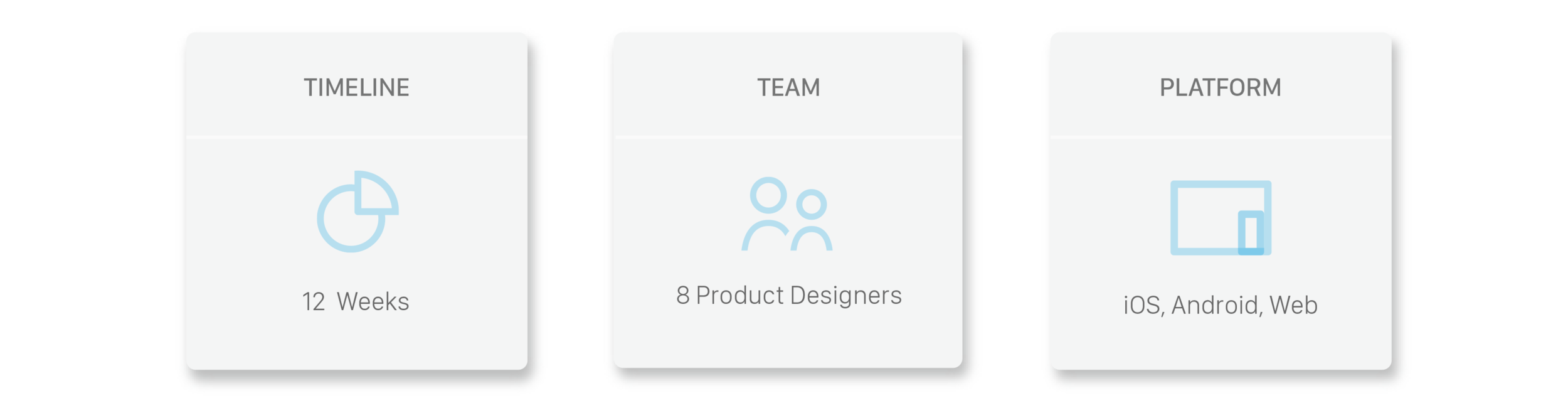
Opportunity: Research, User testing, UX/UI Design (iOS, Android, Web)
Challenge: Maximize Value Education, Improve Onboarding
Role: Lead Product Design Consultant (Contract)

HOVER uses patented technology to turn exterior home photos, captured with a smartphone, into a scaled 3D model. Users are then provided with all accurate measurements and an interactive model to plan and design their perfect project.
Opportunity
We worked with the HOVER team on maximizing the value education and improving the onboarding experience such as the self-identification process.
Role
I worked as a consultant with a team of product designers on the below:
- Co-led the research phase, performed research and user testing with target users, synthesized all information through affinity mapping/personas
- Co-led the design studio, designed Lo-Fi mockups, and validated with target users
- Led the team during Hi-Fi, designed style guide and Hi-Fi prototype, iterated and validated through user testing
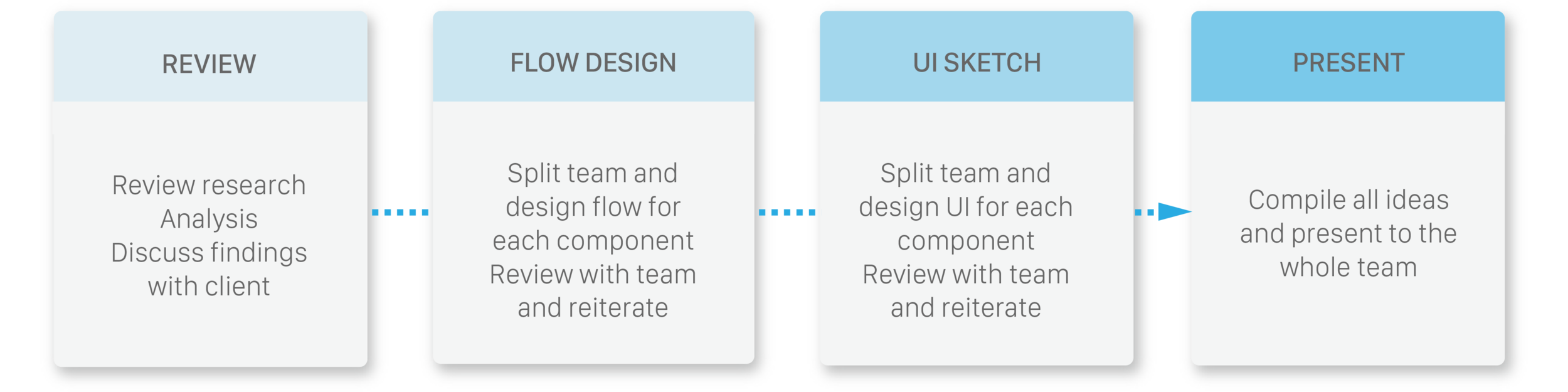
Process

1. Empathize
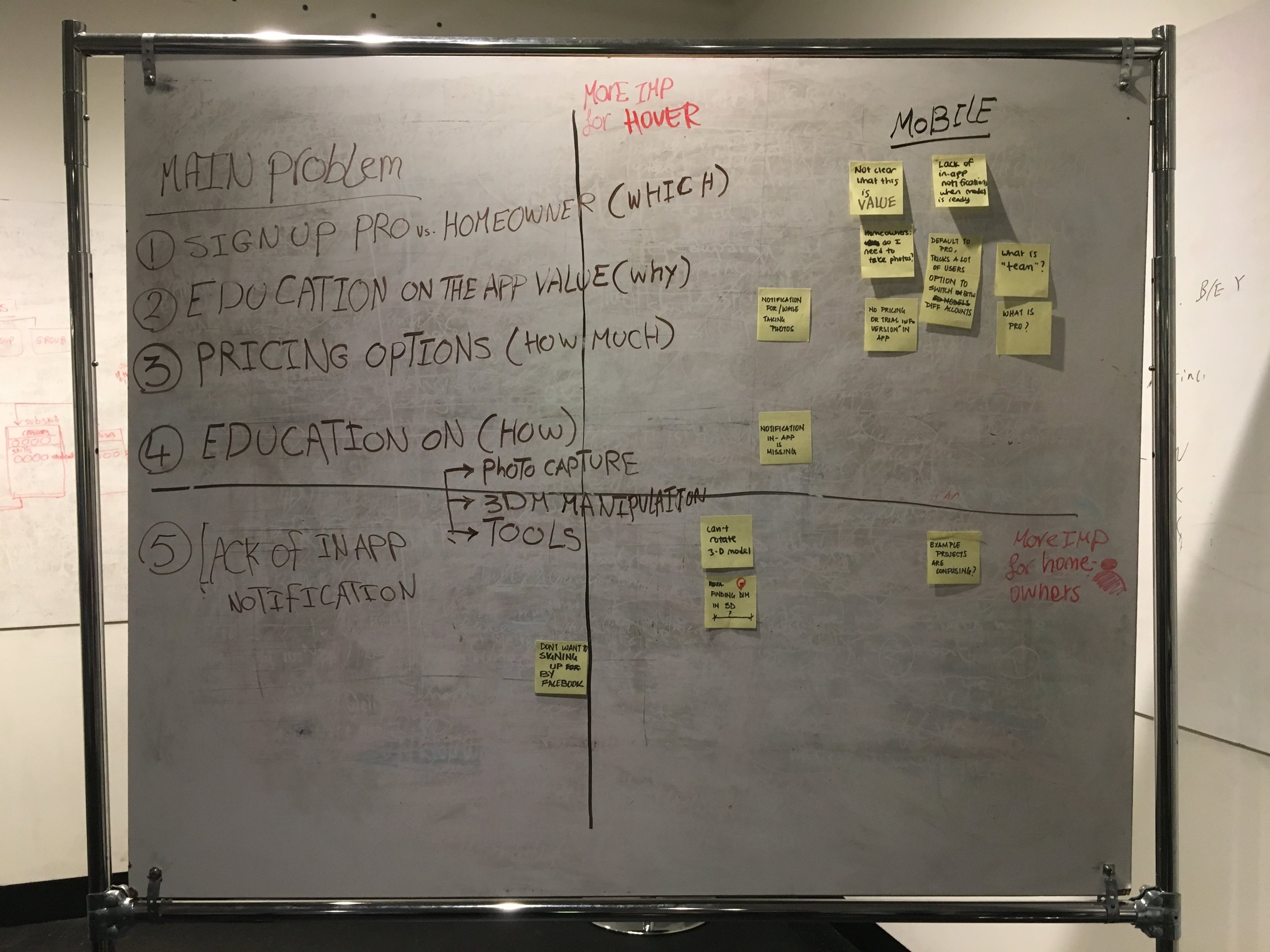
Understanding the Current Problem
With the help of the HOVER team we reached out to new and existing users inside and outside of our network. We crafted questions that targeted each specific user and their unique needs. We gathered many valuable findings including insight regarding new features and tools that could benefit the users.
Goals for this phase:
- Sign up process: To examine reasons for unsuccessful self identification
- Comprehension of value: To discover confusion around HOVER's value during onboarding
- Project completion: To understand any friction that may cause users to not complete projects
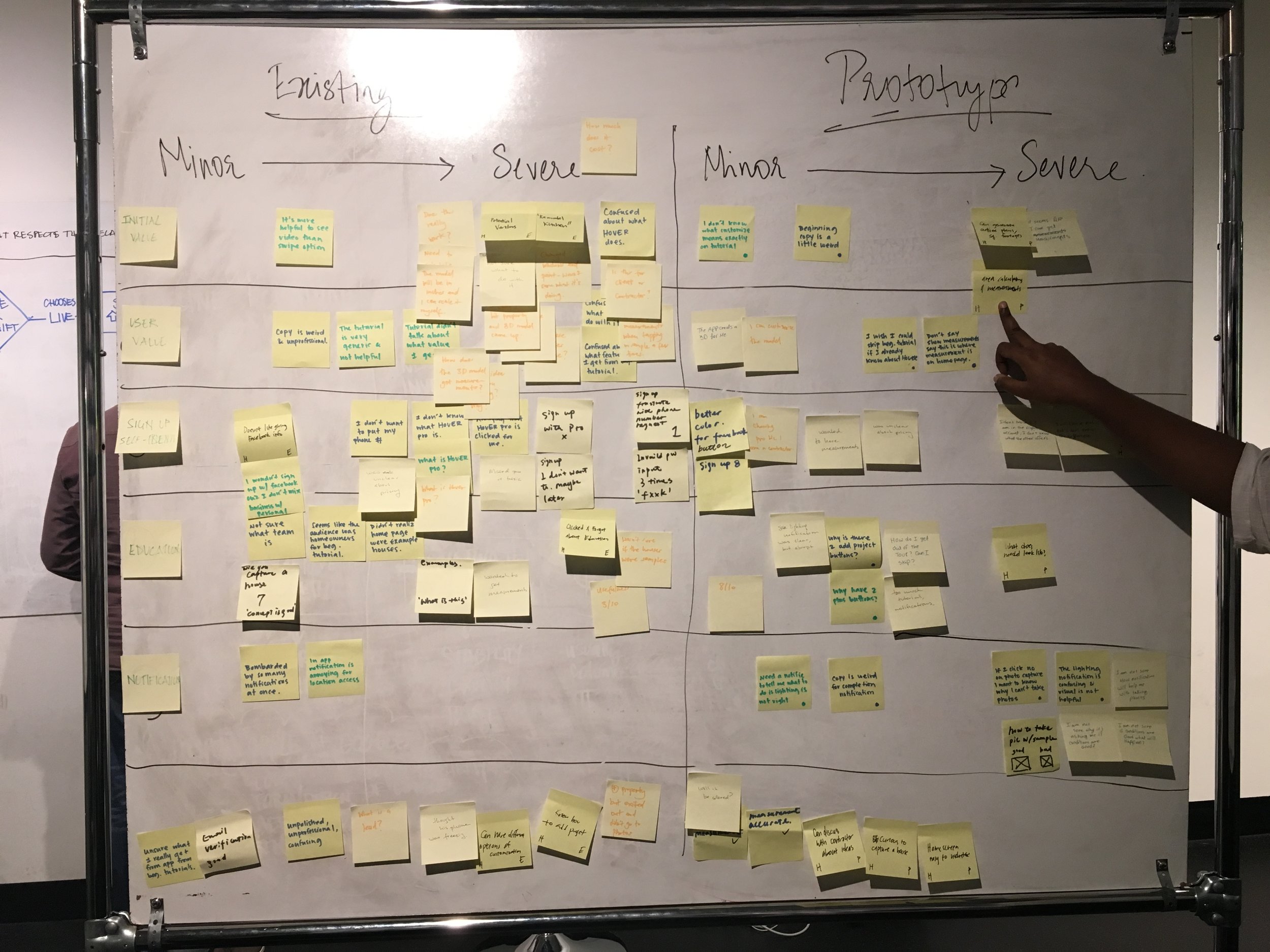
User Testing Results
HOVER has 2 main users, homeowners and professionals, and offers unique values to each persona. We spoke with 5 existing and new users (homeowners and professional users) and assessed their % of success on completing each of the below categories. Based on our findings (shown below) most users faced friction throughout the testing on the below pain points:

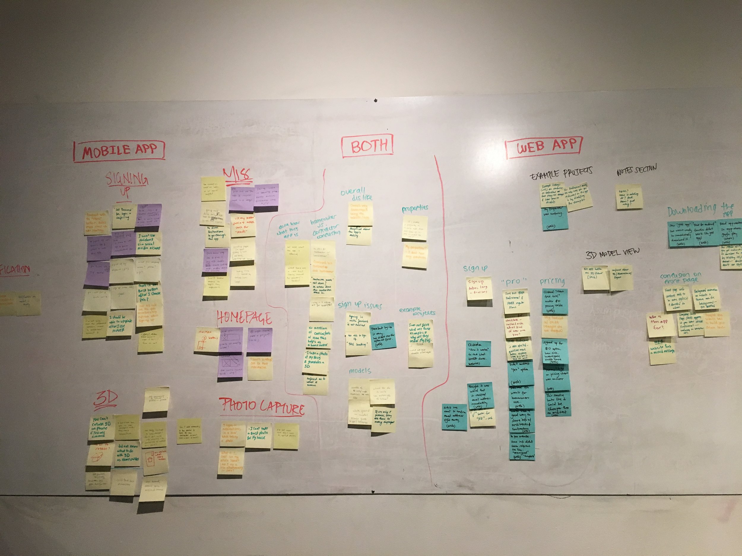
2. Synthesize
Affinity Mapping
We then placed our findings on the affinity map below to prioritized the pain points according to their level of importance to HOVER and users:

Personas
Next we created personas to better understand the target user:

3. Ideate
Lo-Fi Phase
After the research phase we discovered that other than one group - existing professional users - the majority of users are confused on the value HOVER offers to each persona. We also learned that many of the happy existing professional users were educated on HOVER from external events and conferences that eased the onboarding process for them.
Goals for this phase:
- Educate users on the high level value of HOVER during onboarding so they know what to expect from the app prior to sign in
- Clearly identify the difference between the 2 personas so users are aware of the unique value added to them based on their unique needs and goals
- Educate users on the features and their navigation such as the example projects, capture process, 3D model, and measurement details so they better comprehend the value
- Notify users of any updates such as the completion of their 3D model and measurements so they are aware of the progress
Design Studio Process
After learning users' problems, needs, and desires we began designing our initial solutions. Below was the process of our design studio:
Lo-Fi Sketching
In our Design studio we divided the team into groups of 2 that focused on a different component. We first began our process on iOS then ensured design consistency through Android and Web.
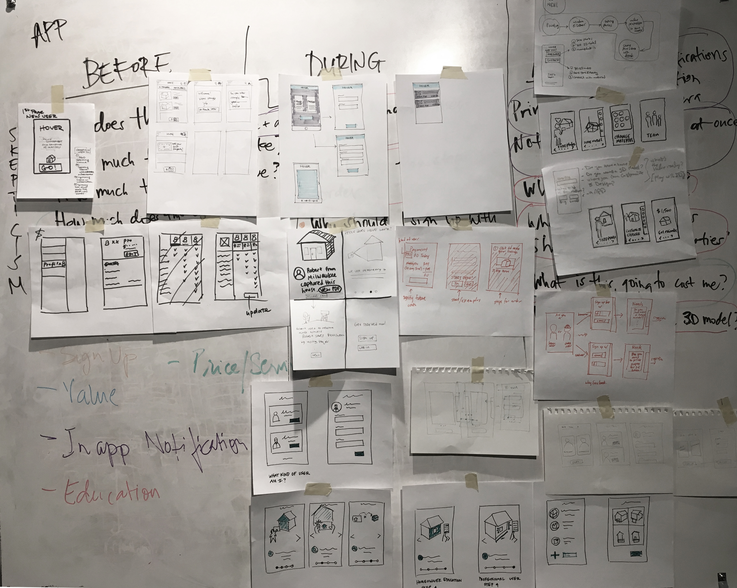
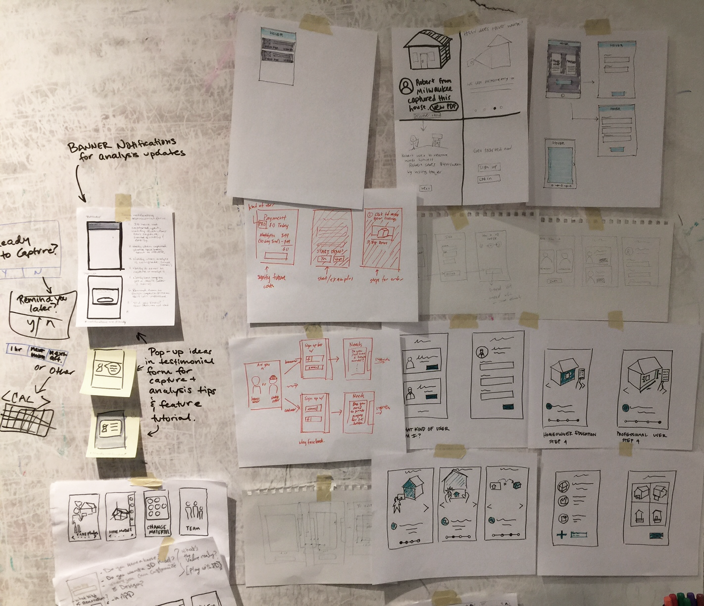
Design Studio Outcome
This was an intensive and focused process of sketching, presenting, collaborating, and validating among the team. We defended solutions, critiqued them, and came to a mutual conclusion as a team on various solutions. As a result, we had a framework to start designing our Lo-Fi prototype.
4. Validate
Hi-Fi Phase
During this phase we iterated our design based on Lo-Fi validation findings. We learned that there were still some confusion around value education, self identification, and navigation of the app, especially with the homeowner users. Therefore, we focused on improving the above while finalizing our UI design.
Component Design
I was responsible for leading this phase of the project. Since we had a large team and a large scope of work it was important to set a solid foundation for our process. We dedicated a component to each team member to be responsible for across iOS and Android. We then dedicated a team just for Web but made sure that we are in constant collaboration and communication throughout our process to ensure consistency.
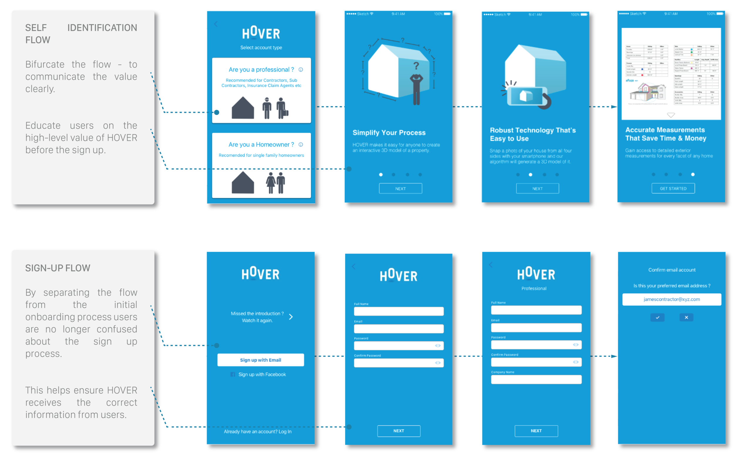
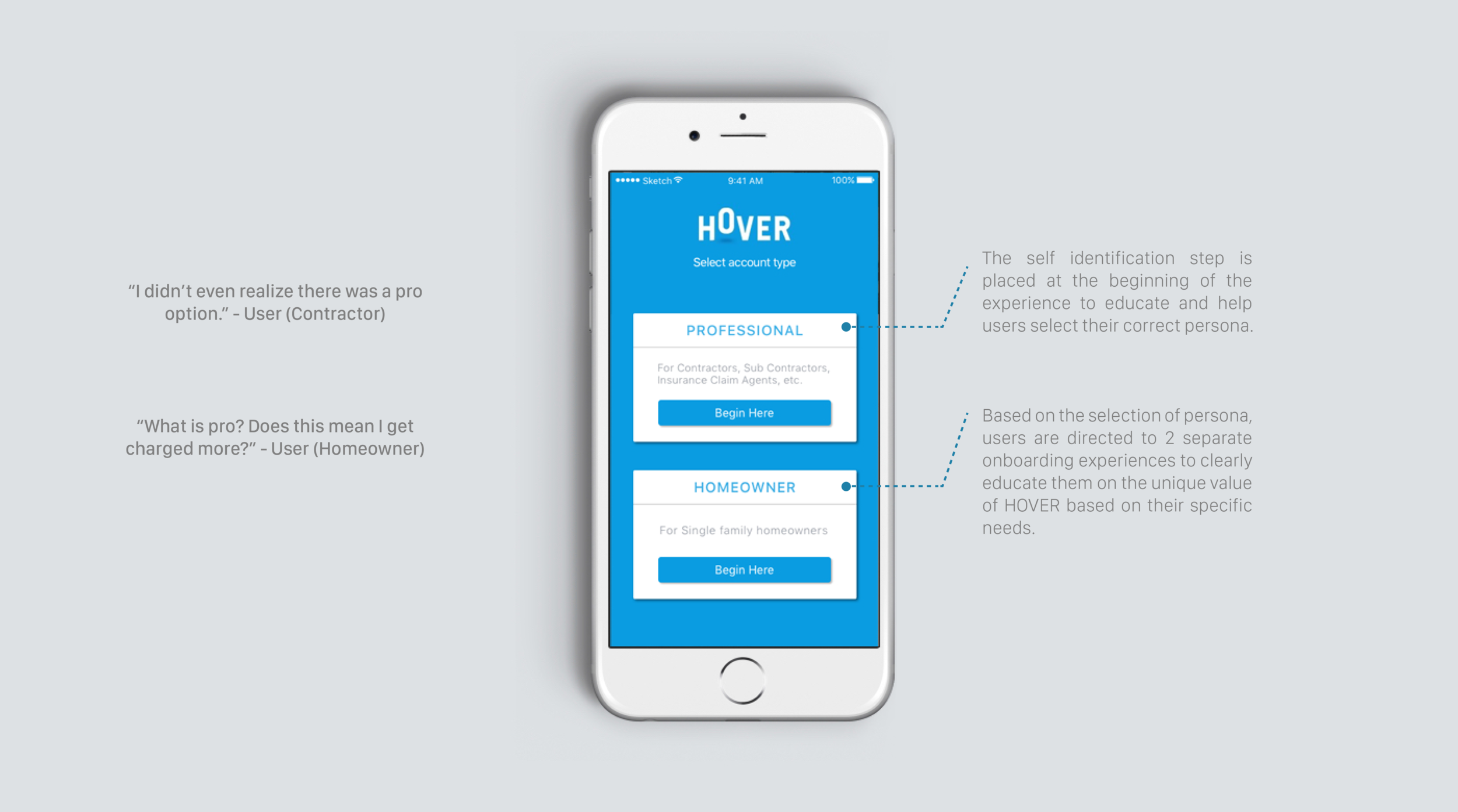
I was also responsible for the design of the self identification, sign up, and value education pages. I had an opportunity to design several versions of the below pages for each component. After rounds of iteration, collaboration with the team, and validation from internal users we finalized the design as shown below:
Sign Up Flow
Through our research we learned that one of the challenges with the current app is that it has the same flow for both personas (homeowner and professional users). This led to confusion as some of the information did not relate to all users.
By separating the onboarding process from the initial step, we designed the flow based on each persona to eliminate any confusion. This included the sign up page, which contained the appropriate questions based on the user's persona. Below is part of the sign up flow for the professional user.

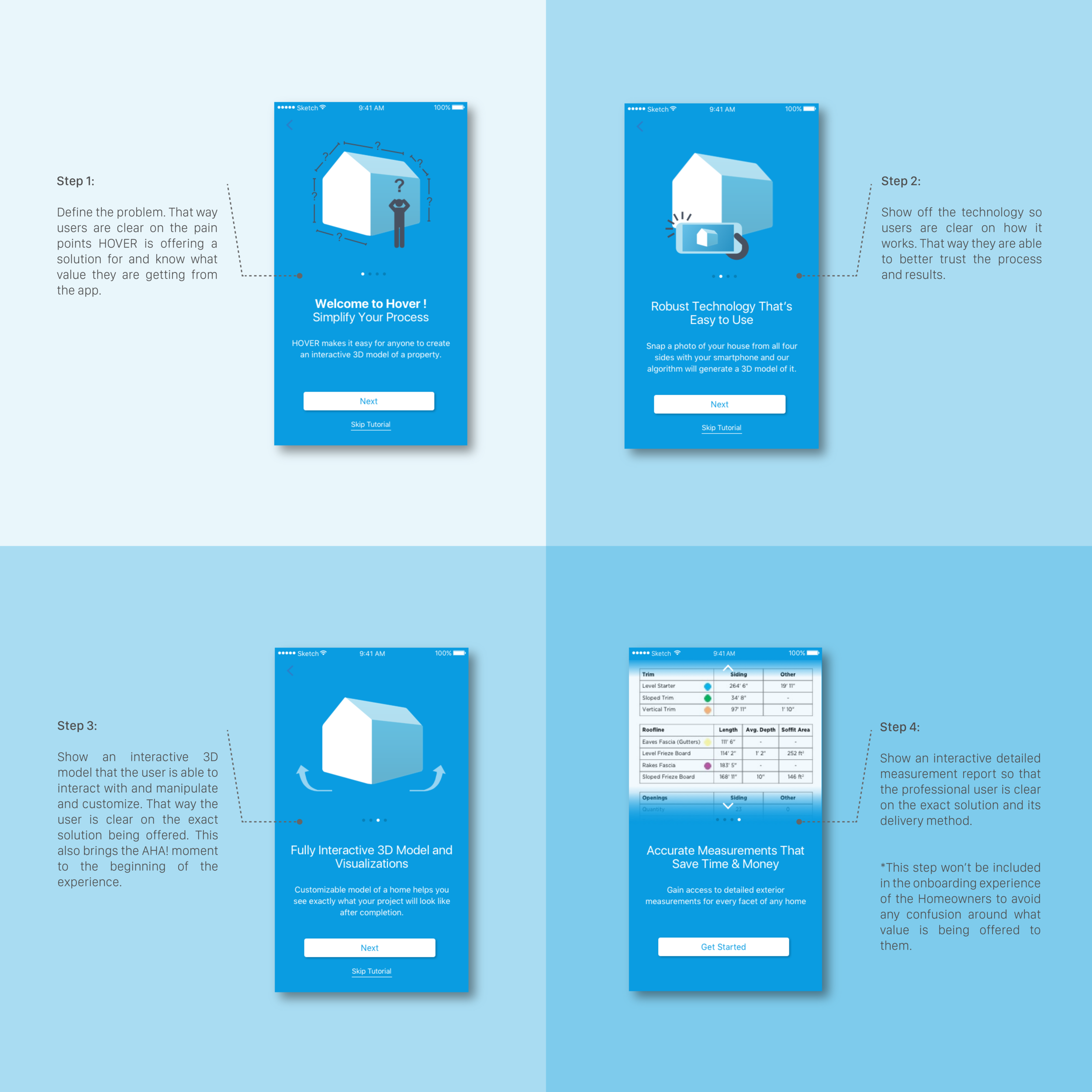
Value Education
During the onboarding experience we added new pages to educate users on the high level value of HOVER. This way users understood the unique problem and solution of the app prior to starting their experience. We eliminated step 4 (measurement feature) from the homeowner flow to clearly identify the unique value they gain in comparison to the professional users.
Android Prototype
Below is our final prototype for Android.
Hi-Fi - Web
Since for HOVER the web platform is primarily used for marketing and navigation of projects, we realized that our flow should be different from the app. For this platform we focused on clearly directing users to downloading the app during sign up, creating a smooth sign up process by redesigning the UI, and creating a more clear property page for better navigation of projects.
Conclusion
The client loved how the team successfully addressed and resolved many of the existing pain points. We were excited to show the results of our Hi-Fi validation and have metrics to compare our success rates during the process.
Below is the results from our Hi-Fi validation:
- Optimized users' comprehension of value
- Increased the percentage of self identification during sign up
- Increased users' comprehension on where to begin their experience
- Increased users' comprehension on how to navigate through the app and its features
- Increased users' comprehension on notifications and completed milestones
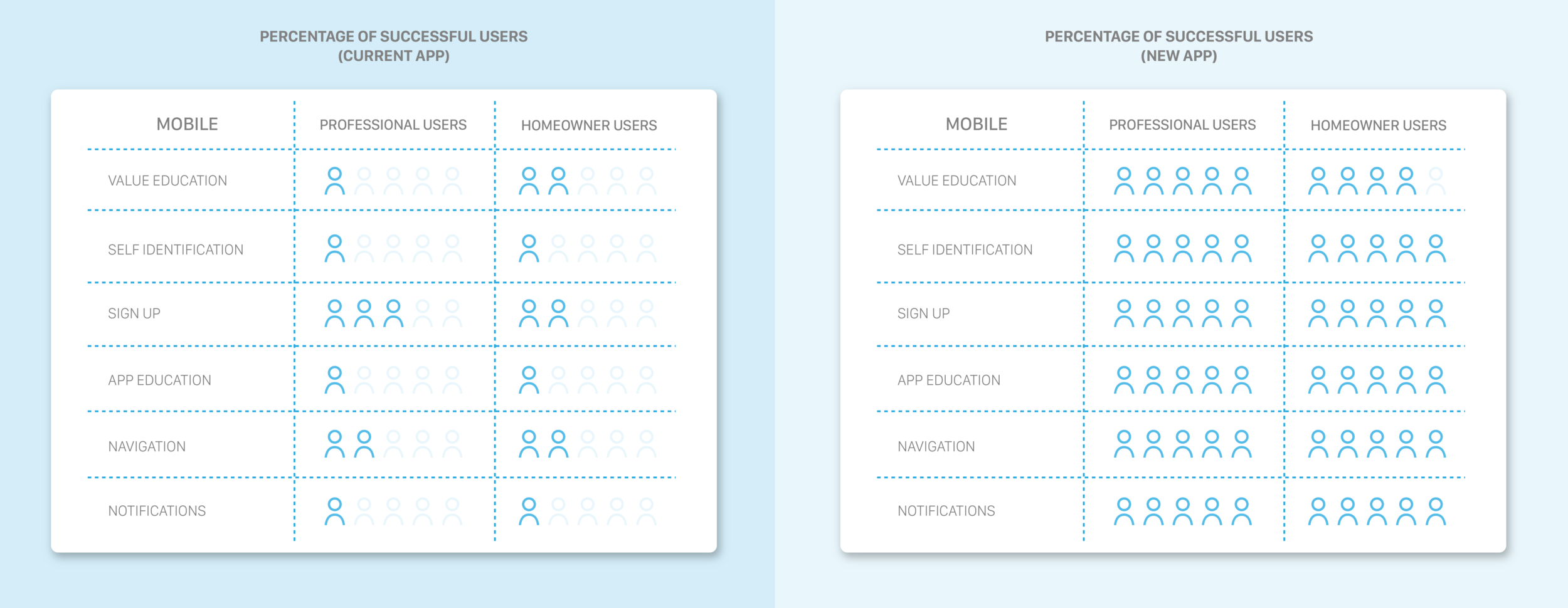
Percentage of successful users - current app vs. new app.